Just a few days after the one year anniversary of the iPhone7 release, Apple debuted the iPhone X and a new set of guidelines for app developers. The key takeaway? Mind the notch.
The notch is a defining feature on the iPhone X, Apple’s first all-screen phone. The device offers a super retina display, wireless charging, and facial unlocking technology. Despite these exciting new features, it is the awkward but deliberate placement of the notch and its impact on app design and functionality that is fueling internet chatter.
If your business has a mobile app, or is in the process of developing one, take note: you’ll need to adjust your interface accordingly. Here’s what you need to know:
The Notch
The peninsular design of the notch does not allow for a horizontal bar to run across the top of the screen, a standard design feature in most apps. Some developers thought they could get around the notch by incorporating a bezel like black bar in apps to hide the notch, but Apple’s message is clear: learn to adapt.
Any icons or notifications that were previously displayed across the top of the screen will have to be redesigned to fit in the “ears” of the phone, the small bits of screen located to the right and left of the notch. Additionally, developers may need to adjust the format of their interface when in landscape mode to prevent the notch from cutting off words or images.
Button free Home Command
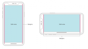
For the iPhone X, Apple chose to forego the signature circular home button. Instead, the user must make a swipe movement across the bottom of the screen for most commands. This means that scrolling features must be updated to prevent app interfaces from interfering with the home command. In the new guidelines, Apple has created a safe area where developers should avoid placing interactive controls.

(Images extracted from Apple Human Interface Guidelines)
Rounded Corners
Unlike the existing iPhone screens’ square border, the iPhone X’s screen extends all the way into the rounded corners of the device. Developers need to make sure that interfaces wrap around the rounded corner, and extend until the end of the screen.
With many already suggesting that the notch may be a feature incorporated into all future iPhones, it’s best to adjust your app’s design and development now. Sure, a major announcement like this can be jarring for businesses that rely on their mobile apps to engage with their customers, but the 10Pearls design and development teams are excited about the new challenge. Contact us today if you need help — we will work with you to embrace the future of mobile and keep your digital product competitive in the market.